
Responsive design is the new “catch phrase” in web design and WordPress makes having a website that looks good on a phone, tablet or desktop possible.
Mobile internet usage is increasing and having a mobile website is extremely important. More than 40% of Google searches are performed on a mobile device.
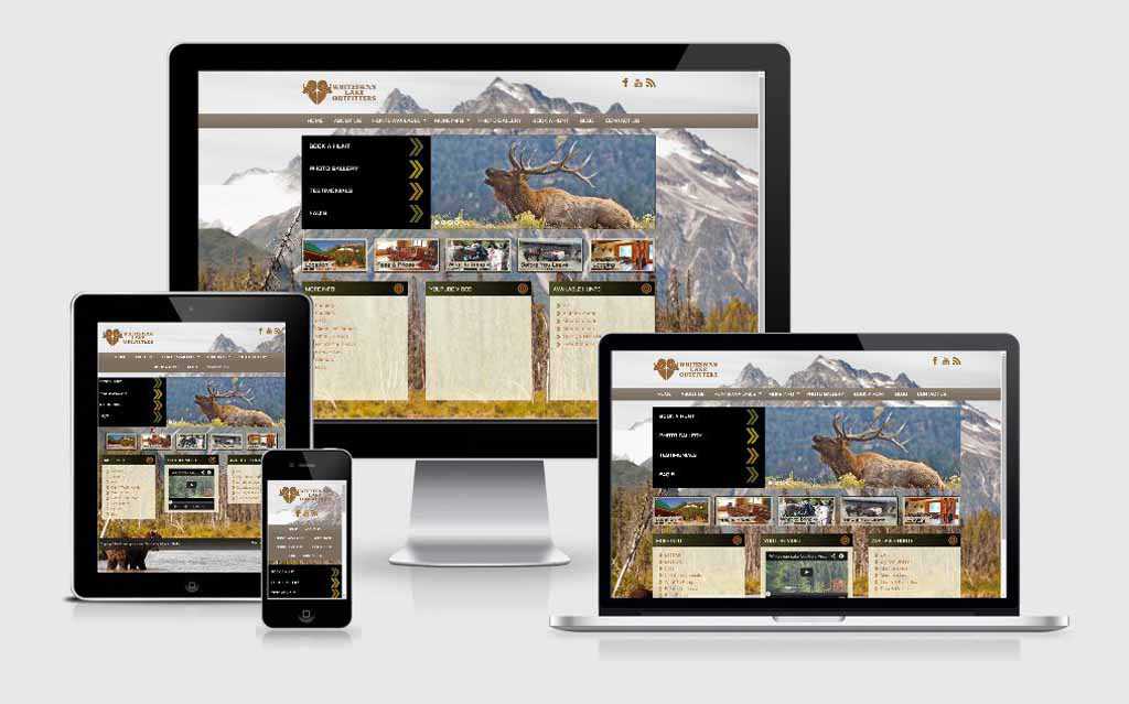
This project was built using a combination of WordPress and the Genesis Framework. The website for Whiteswan Lake Outfitters (www.whiteswanlake.com) was built with a responsive design in mind which means it will look good on a phone, tablet, or desktop computer. It also has the added benefit of using the Genesis framework which was created with search engines in mind. This means your site’s SEO (search engine optimization) will boost your website to the top of the Google rankings.
If you need your customers to find you on the MOBILE WEB look no further than WordPress and the Genesis Framework.
Read more about the changes that will be taking place with Google’s search algorithm.


